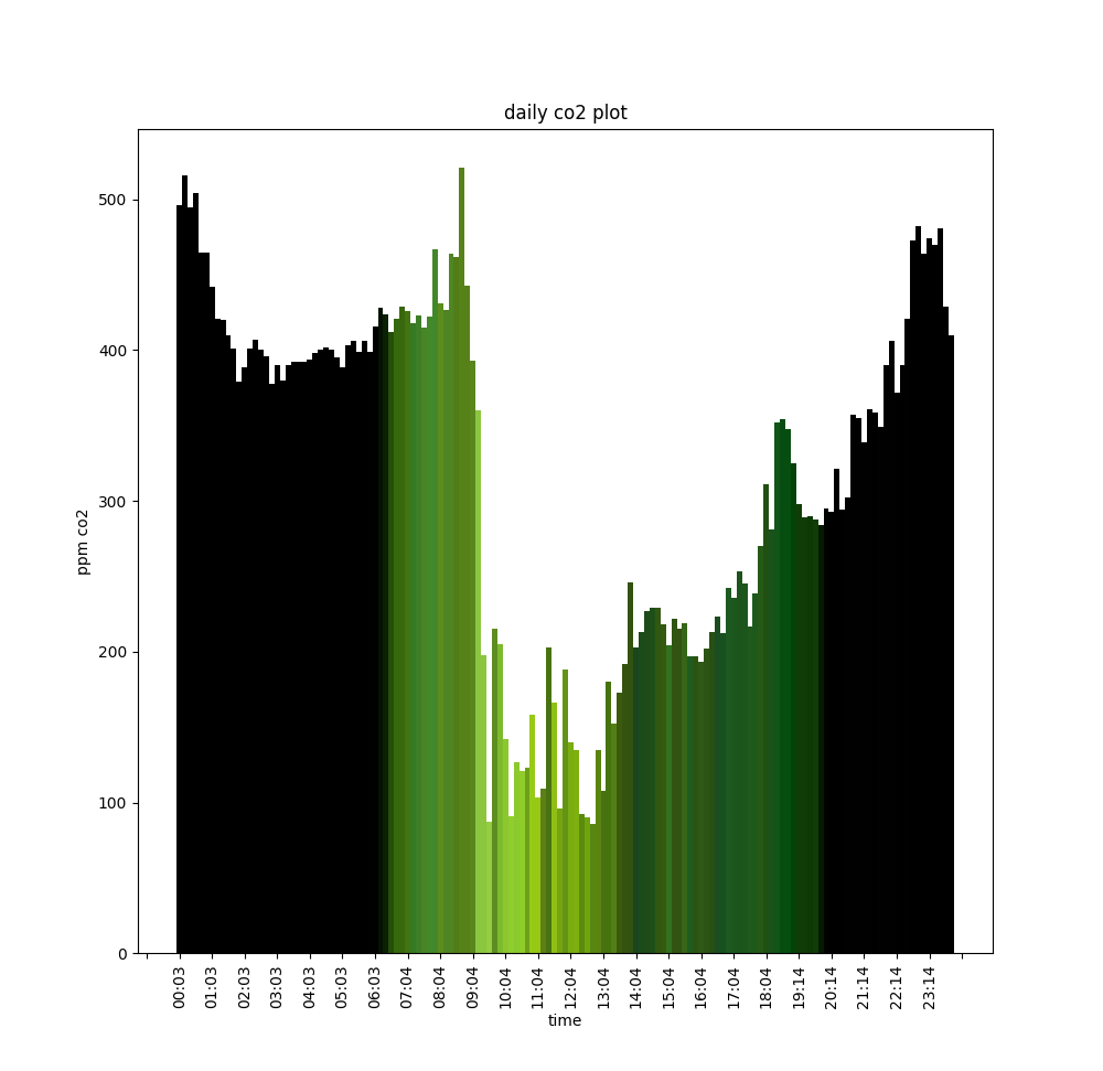
Graph showing the last 24hrs of data from planktochrome
The colour of the plankton and the carbon dioxide level in the installation are monitored throughout the day. The data recorded are plotted in bar charts that reflect the plankton's photosynthesis, the changing environmental conditions and the how the space is being used.

This graph was recorded in early summer from Experiment 1.0 on a bright sunny day, where the photosynthesis of the plankton dramatically reduced the amount of carbon dioxide in the air. The previous graph was from the last day of the exhibition at Newbridge project in December and the differences can be easily seen.
